5 Essential Tips to Transform Complex Data into Stunning Visuals
Transforming complex data into stunning visuals is crucial for effective communication. Here are 5 essential tips to help you achieve this:
- Understand Your Audience: Before you start creating visuals, consider who will be viewing them. Tailoring your visuals to meet the needs and preferences of your audience can significantly improve engagement and comprehension.
- Choose the Right Type of Visualization: Different types of data require different approaches. Whether you’re presenting trends, comparisons, or distributions, selecting the appropriate chart or graph is key to conveying your message clearly.
Additionally, ensuring that your visuals are not only informative but also aesthetically pleasing is essential. Here are three more tips:
- Utilize Color Wisely: Colors can draw attention and highlight important information, but it's essential to use them thoughtfully. Stick to a cohesive color palette to maintain professionalism and avoid overwhelming your audience.
- Simplify and Focus: Avoid cluttering your visuals with unnecessary data. Keep your design clean by focusing on the most critical information, making it easier for your audience to grasp the key messages.
- Iterate and Get Feedback: Share your visuals with peers or potential audience members before finalizing them. Constructive feedback can help you refine your designs and ensure clarity and effectiveness.
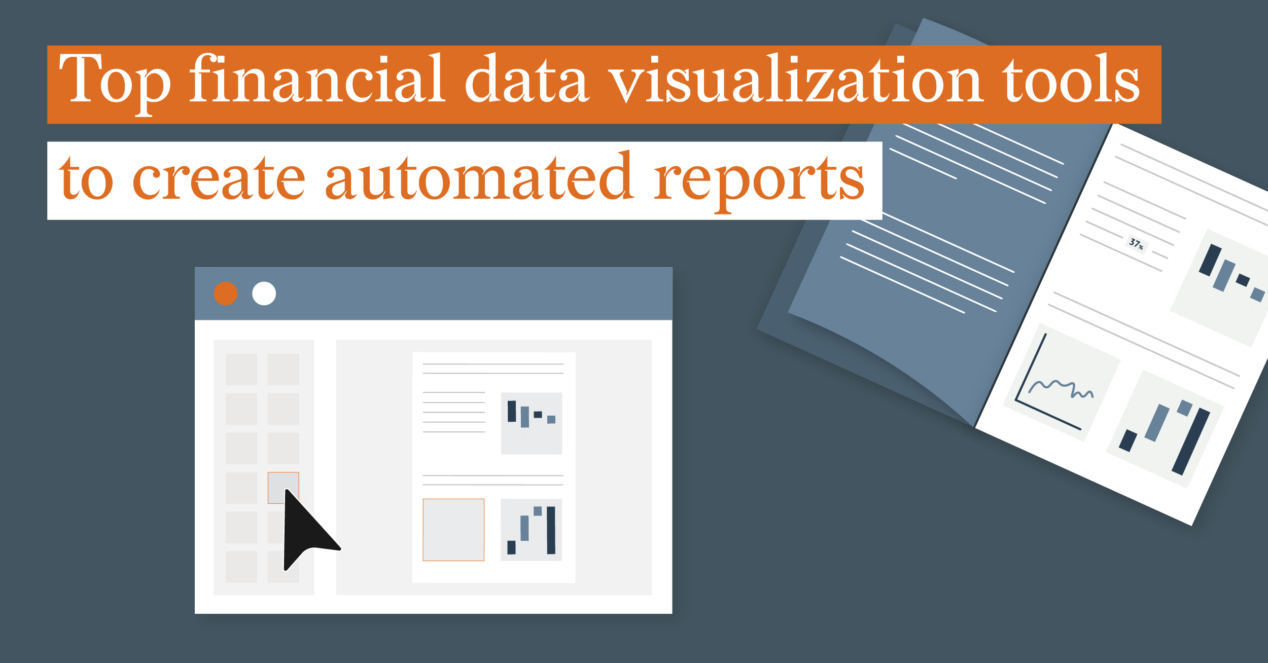
How to Choose the Right Visualization Tools for Your Data Needs
Choosing the right visualization tools for your data needs is essential for effectively communicating insights and making informed decisions. Start by considering the type of data you present; different tools excel at visualizing various datasets. For instance, if you are working with time-series data, a tool that specializes in line graphs might be appropriate. Additionally, assess the complexity of your data. Simple visualization needs may be met with basic tools like Excel, whereas more complex datasets might require advanced tools such as Tableau or Power BI that offer robust analytical capabilities.
Another crucial factor in selecting the right visualization tool is the audience and their level of expertise. If your viewers are data-savvy, more sophisticated visualizations might be beneficial, whereas a general audience may prefer simpler, more intuitive graphics. Consider the cost as well; while some tools are free, others may require a subscription. Conducting a trial run with a few tools can further help you evaluate their effectiveness. By keeping these aspects in mind, you can make a well-informed decision that aligns with your specific data visualization needs.
What Are the Best Practices for Creating Engaging Data Visualizations?
Creating engaging data visualizations requires a thoughtful approach to design and clarity. One of the best practices is to choose the right type of visualization based on the data being presented. For instance, bar charts are effective for comparing categories, while line charts are ideal for showcasing trends over time. Additionally, ensuring that your visual elements are easily interpretable is crucial; use a consistent color palette, proper labeling, and legends to aid comprehension. A good rule of thumb is to simplify complex data into digestible components, avoiding unnecessary clutter that can distract from the key message.
Another essential practice is to consider your audience's perspective. Tailoring your data visualization to {for the} target demographic enhances engagement. Gather feedback from users to inform design improvements, focusing on aspects like interactivity to facilitate exploration of the data. Incorporating elements such as tooltips, zoom features, and responsive designs can make the experience more immersive. Lastly, always remember to provide context through descriptive titles and annotations; this guides viewers in understanding the significance of the data and its implications, making your visualizations not only engaging but also informative.